Code
p <- forecast::autoplot(TSstudio::Michigan_CS) +
    xlab("") +
    ylab("Index")
plotly::ggplotly(p)The goal of this lecture is to introduce time series and their common components. You should become confident in identifying and characterizing trends, seasonal and other variability based on visual analysis of time series plots and plots of autocorrelation functions.
Objectives
Reading materials
‘A time series is a set of observations \(Y_t\), each one being recorded at a specific time \(t\)’ (Brockwell and Davis 2002). The index \(t\) will typically refer to some standard unit of time, e.g., seconds, hours, days, weeks, months, or years.
‘A time series is a collection of observations made sequentially through time’ (Chatfield 2000).
A stochastic process is a sequence of random variables \(Y_t\), \(t = 1, 2, \dots\) indexed by time \(t\), which can be written as \(Y_t\), \(t \in [1,T]\). A time series is a realization of a stochastic process.
We shall frequently use the term time series to mean both the data and the process.
Let’s try to describe the patterns we see in Figure 2.1, Figure 2.2, and Figure 2.3.
p <- forecast::autoplot(TSstudio::Michigan_CS) +
xlab("") +
ylab("Index")
plotly::ggplotly(p)ggplot2::autoplot(JohnsonJohnson) +
xlab("") +
ylab("Earnings per share (USD)")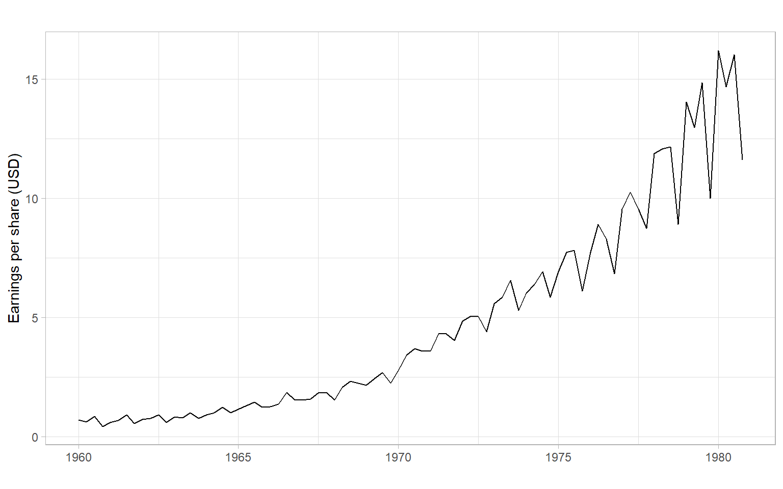
In this course, we will be interested in modeling time series to learn more about their properties and to forecast (predict) future values of \(Y_t\), i.e., values of \(Y_t\) for \(t\) beyond the end of the data set. Typically, we will use the historical data (or some appropriate subset of it) to build our forecasting models.
A time series can generally be expressed as a sum or product of four distinct components: \[ Y_t = M_t + S_t + C_t + \epsilon_t \] or \[ Y_t = M_t \cdot S_t \cdot C_t \cdot \epsilon_t, \] where
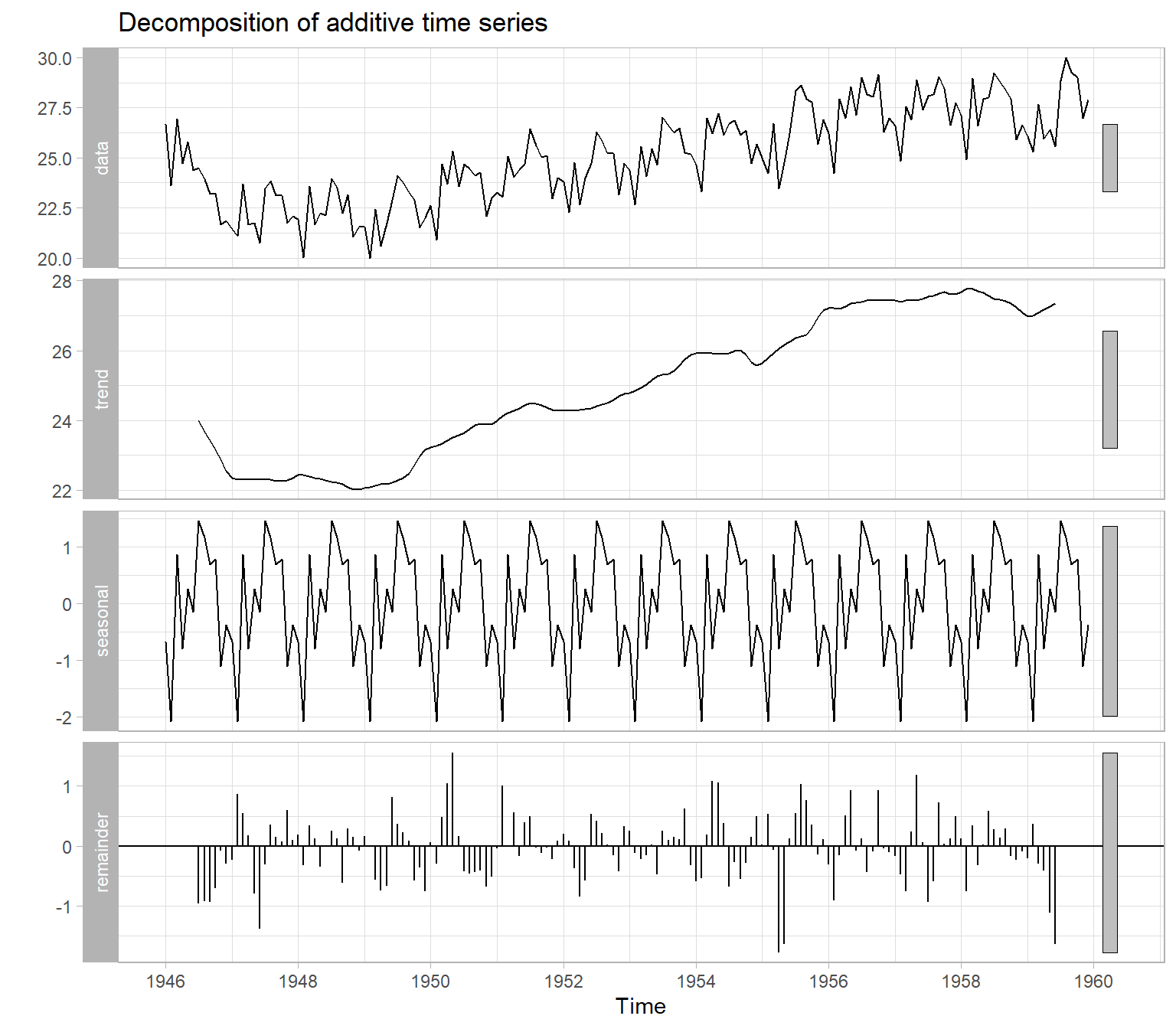
Figure 2.4 illustrates an automatic decomposition, however, because the user has too little control over how the decomposition is done, this function is not recommended. We will talk about the alternatives in the next lecture.
There are two general classes of forecasting models.
Univariate time series models include different types of exponential smoothing, trend models, autoregressive models, etc. The characteristic feature of these models is that we need only one time series to start with (\(Y_t\)), then we can build a regression of this time series over time (\(Y_t \sim t\)) for estimating the trend or, for example, an autoregressive model (‘auto’ \(=\) self). In the autoregressive approach, the current value \(Y_t\) is modeled as a function of the past values: \[ Y_t = f(Y_{t-1}, Y_{t-2}, \dots, Y_{t-p}) + \epsilon_t. \tag{2.1}\] A linear autoregressive model has the following form (assume that function \(f(\cdot)\) is a linear parametric function, with parameters \(\phi_0, \phi_1, \dots, \phi_p\)): \[ Y_t = \phi_0 + \phi_1 Y_{t-1} + \phi_2 Y_{t-2} + \dots +\phi_p Y_{t-p} + \epsilon_t. \]
Multivariate models involve additional covariates (a.k.a. regressors, predictors, or independent variables) \(X_{1,t}, X_{2,t}, \dots, X_{k,t}\). A multivariate time series model can be as simple as the multiple regression \[ Y_t = f(X_{1,t}, X_{2,t}, \dots, X_{k,t}) + \epsilon_t, \] or involve lagged values of the response and predictors: \[ \begin{split} Y_t = f(&X_{1,t}, X_{2,t}, \dots, X_{k,t}, \\ &X_{1,t-1}, X_{1,t-2}, \dots, X_{1,t-q1}, \\ &\dots\\ &X_{k,t-1}, X_{k,t-2}, \dots, X_{k,t-qk}, \\ &Y_{t-1}, Y_{t-2}, \dots, Y_{t-p}) + \epsilon_t, \end{split} \tag{2.2}\] where \(p\), \(q1, \dots, qk\) are the lags. We can start the analysis with many variables and build a forecasting model as complex as Equation 2.2, but remember that a simpler univariate model may also work well. We should create an appropriate univariate model (like in Equation 2.1) to serve as a baseline, then compare the models’ performance on some out-of-sample data, as described in Chapter 10.
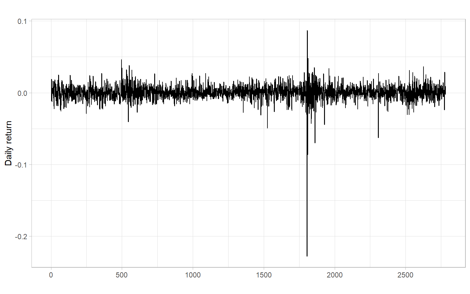
ggplot2::autoplot(sunspots) +
    xlab("") +
    ylab("Sunspot number")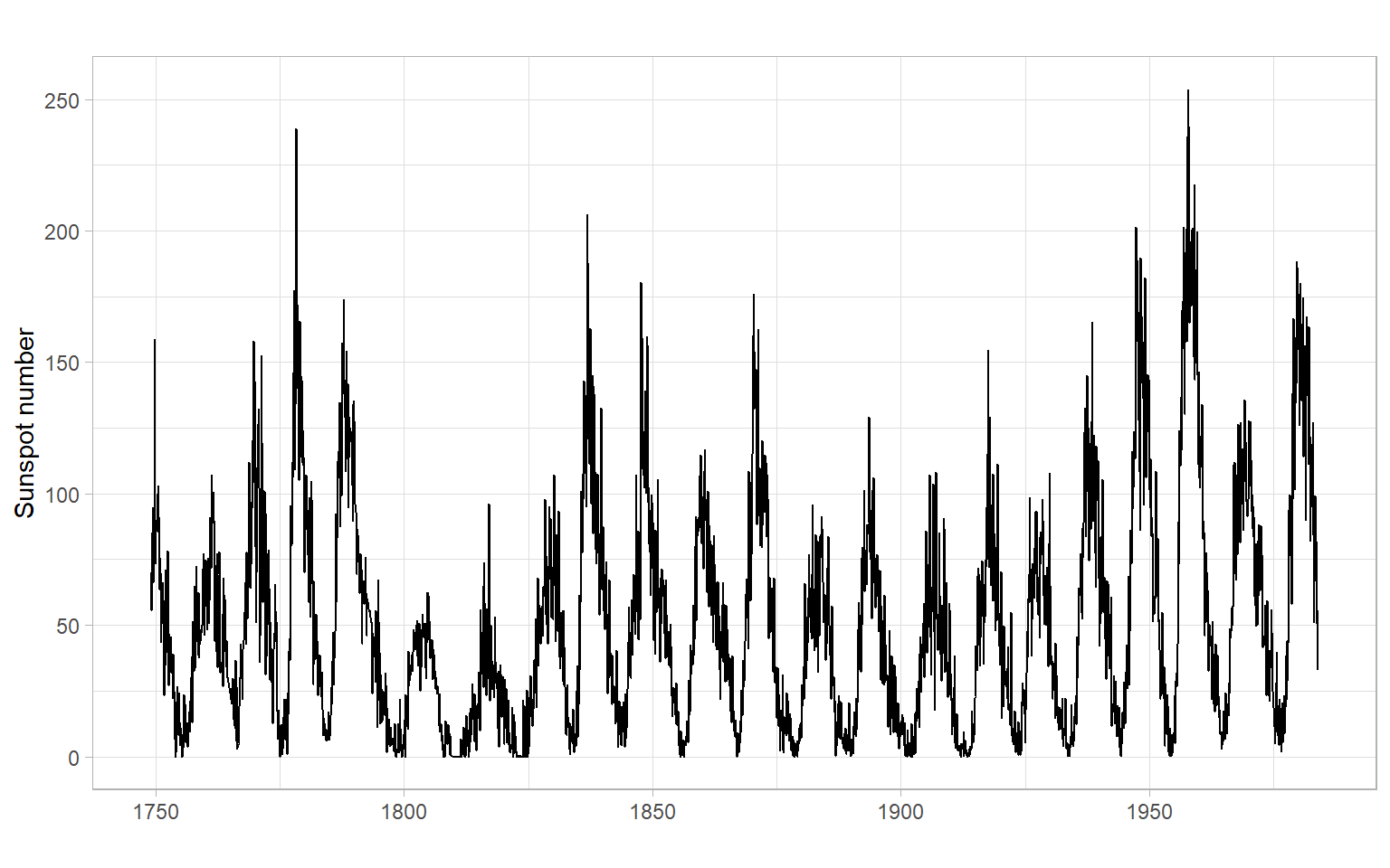
ggplot2::autoplot(lynx) +
    xlab("") +
    ylab("Number of lynx trappings")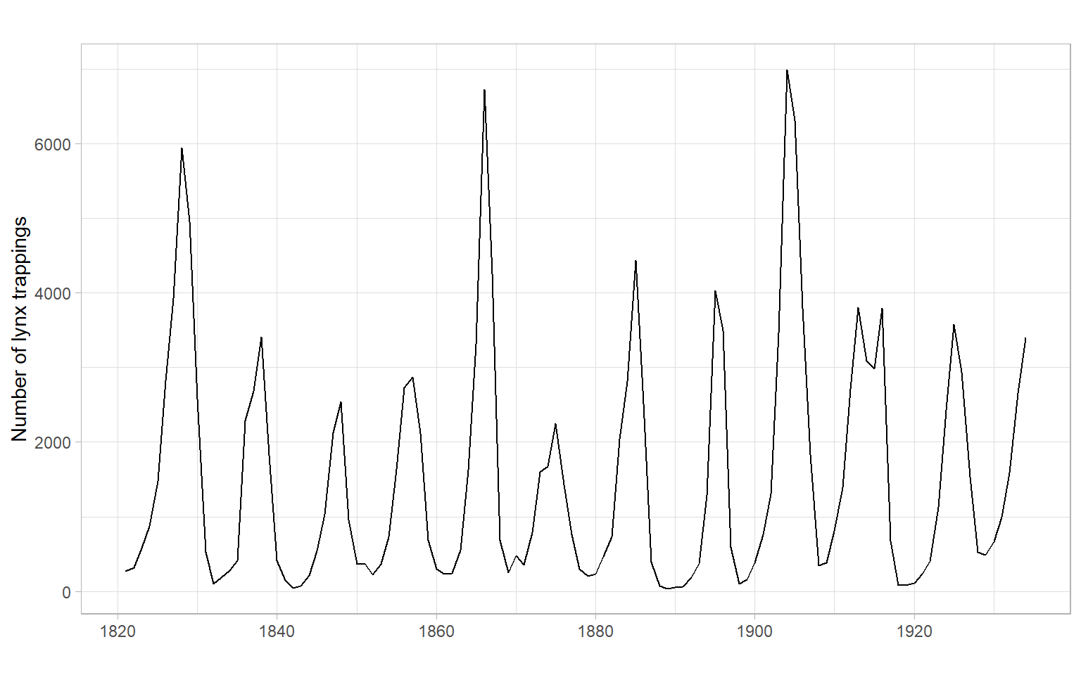
ggplot2::autoplot(Ecdat::Consumption[,"yd"]/1000) +
    xlab("") +
    ylab("Income (thousand 1986 dollars)")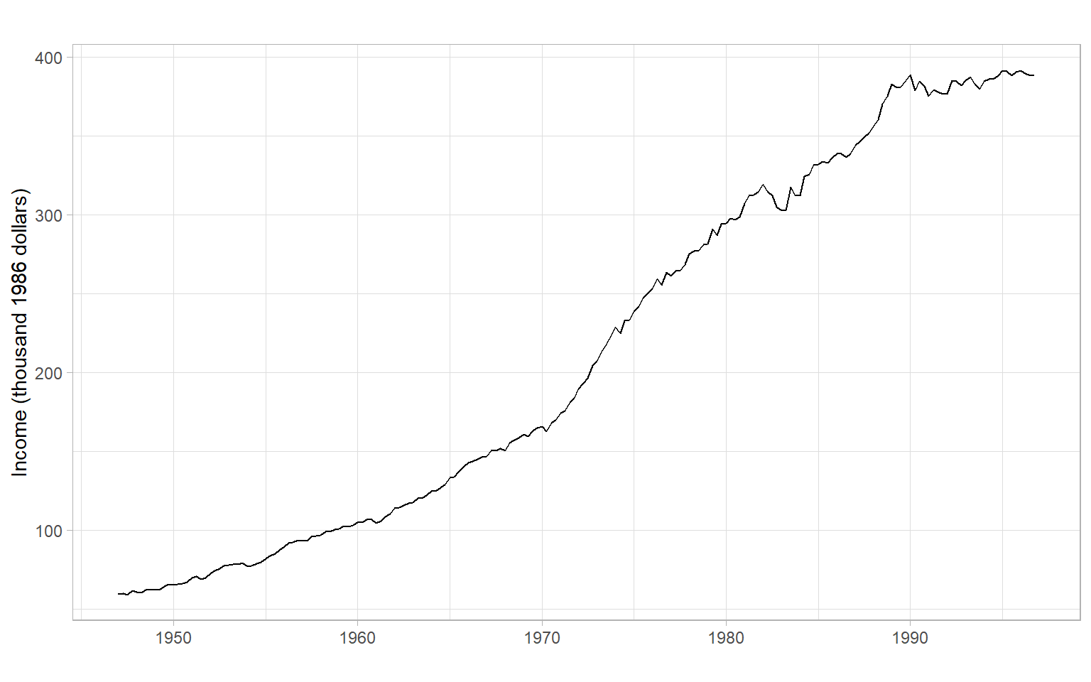
Recall that a random process is a sequence of random variables, so its model would be the joint distribution of these random variables \[ f_1(Y_{t_1}), \; f_2(Y_{t_1}, Y_{t_2}), \; f_3(Y_{t_1}, Y_{t_2}, Y_{t_3}), \dots \]
With sample data, usually, we cannot estimate so many parameters. Instead, we use only first- and second-order moments of the joint distributions, i.e., \(\mathrm{E}(Y_t)\) and \(\mathrm{E}(Y_tY_{t+h})\). In the case when all the joint distributions are multivariate normal (MVN), these second-order properties completely describe the sequence (we do not need any other information beyond the first two moments in this case).
It is time to give more formal definitions of stationarity. Loosely speaking, a time series \(X_t\) (\(t=0,\pm 1, \dots\)) is stationary if it has statistical properties similar to those of the time-shifted series \(X_{t+h}\) for each integer \(h\).
Let \(X_t\) be a time series with \(\mathrm{E}(X^2_t)<\infty\), then the mean function of \(X_t\) is \[ \mu_X(t)=\mathrm{E}(X_t). \]
The autocovariance function of \(X_t\) is \[ \gamma_X(r,s) = \mathrm{cov}(X_r,X_s) = \mathrm{E}[(X_r-\mu_X(r))(X_s-\mu_X(s))] \tag{2.3}\] for all integers \(r\) and \(s\).
Weak stationarity
\(X_t\) is (weakly) stationary if \(\mu_X(t)\) is independent of \(t\), and \(\gamma_X(t+h,t)\) is independent of \(t\) for each \(h\) (consider only the first two moments): \[ \begin{split} \mathrm{E}(X_t) &= \mu, \\ \mathrm{cov}(X_t, X_{t+h}) &= \gamma_X(h) < \infty. \end{split} \tag{2.4}\]
Strong stationarity
\(X_t\) is strictly stationary if (\(X_1, \dots, X_n\)) and (\(X_{1+h}, \dots, X_{n+h}\)) have the same joint distribution (consider all moments).
Strictly stationary \(X_t\) with finite variance \(\mathrm{E}(X_t^2) <\infty\) for all \(t\) is also weakly stationary.
If \(X_t\) is a Gaussian process, then strict and weak stationarity are equivalent (i.e., one form of stationarity implies the other).
In applications, it is usually very difficult if not impossible to verify strict stationarity. So in the vast majority of cases, we are satisfied with the weak stationarity. Moreover, we usually omit the word ‘weak’ and simply talk about stationarity (but have the weak stationary in mind).
Given the second condition of weak stationarity in Equation 2.4, we can write for stationary(!) time series the autocovariance function (ACVF) for the lag \(h\): \[ \gamma_X(h)= \gamma_X(t+h,t) = \mathrm{cov}(X_{t+h},X_t) \] and the autocorrelation function (ACF), which is the normalized autocovariance: \[ \rho_X(h)=\frac{\gamma_X(h)}{\gamma_X(0)}=\mathrm{cor}(X_{t+h},X_t). \]
The sample autocovariance function is defined as: \[
\hat{\gamma}_X(h)= n^{-1}\sum_{t=1}^{n-k}(x_{t+h}- \bar{x})(x_t - \bar{x}),
\] with \(\hat{\gamma}_X(h) = \hat{\gamma}_X(-h)\) for \(h = 0,1,\dots, n-1\). In R, use acf(X, type = "covariance").
The sample autocorrelation function is defined as (in R, use acf(X)): \[
\hat{\rho}_X(h)=\frac{\hat{\gamma}_X(h)}{\hat{\gamma}_X(0)}.
\]
acf(). Autocorrelations that reach outside this bound are then statistically significant. Note that in R as a rule of thumb the default maximal lag is \(10 \log_{10}(n)\), and the same \(n\) is used for the confidence bounds at all lags (however, in reality, samples of different sizes are used for each lag).The last property is yet another tool for testing autocorrelation in a time series, in addition to those listed in Chapter 1. Also, see the Ljung–Box test described below.
Ljung–Box test
Instead of testing autocorrelation at each lag, we can apply an overall test by Ljung and Box (1978):
\(H_0\): \(\rho(1) = \rho(2) = \dots = \rho(h) = 0\)
\(H_1\): \(\rho(j) \neq 0\) for some \(j \in \{1, 2, \dots, h\}\), where \(n > h\).
The Ljung–Box test statistic is given by \[
Q_h = n(n + 2) \sum_{j = 1}^h\frac{\hat{\rho}_j^2}{n - j}.
\] Under the null hypothesis, \(Q_h\) has a \(\chi^2\) distribution with \(h\) degrees of freedom. In R, this test is implemented in the function Box.test() with the argument type = "Ljung-Box" and in the function tsdiag().
The time series plot of births in Figure 2.11 shows a trend. The time series is not stationary. Thus, the calculated ACF is mostly useless (it is calculated under the assumption of stationarity), but we notice some periodicity in the ACF – it is a sign of periodicity in the time series itself (seasonality). Need to remove the trend (and seasonality) and repeat the ACF analysis.
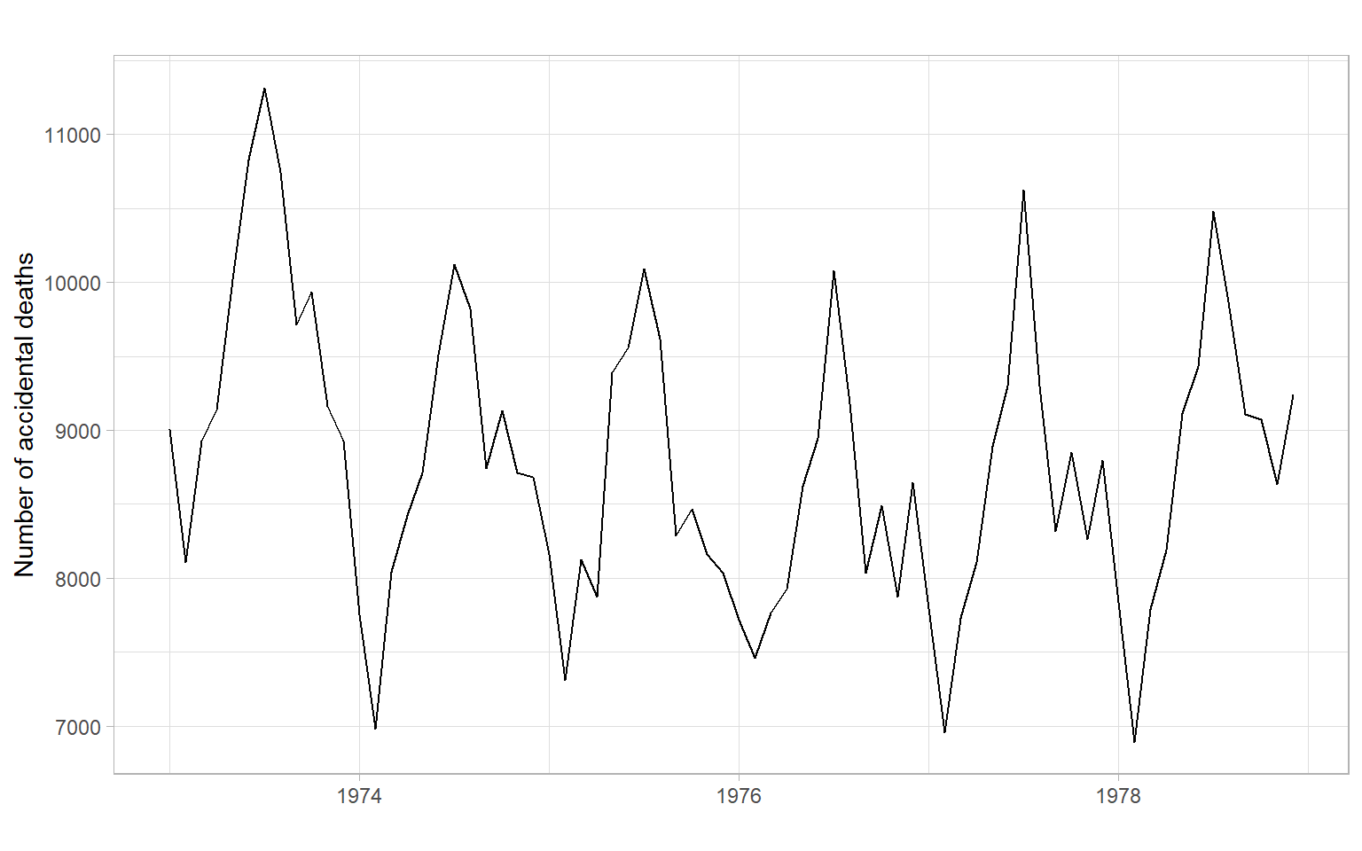
Compare with the plots for accidental deaths in Figure 2.12.
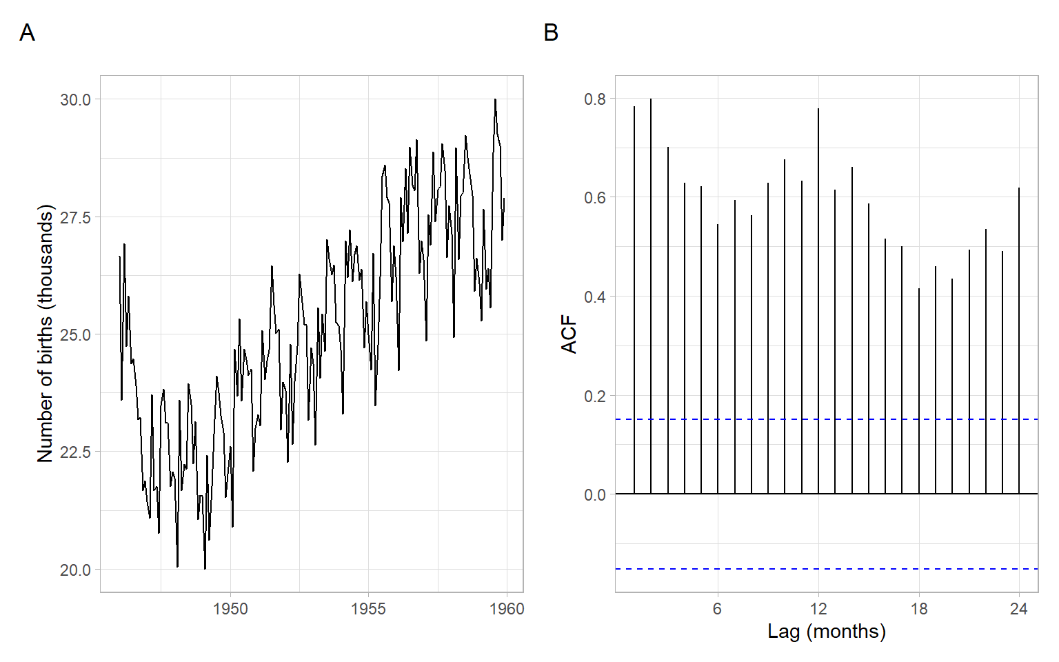
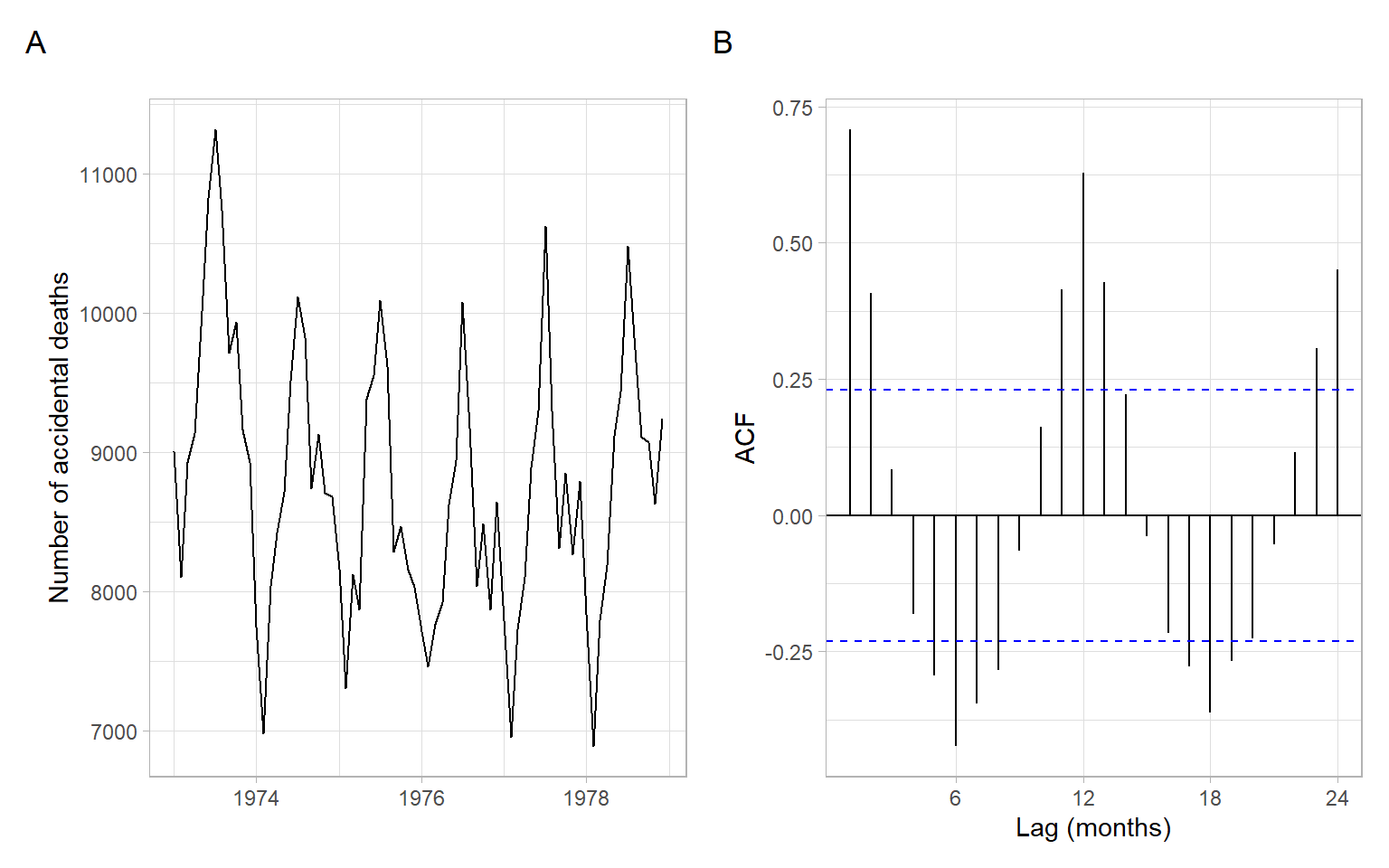
Figure 2.12 shows a slight trend of declining, then increasing deaths; the seasonal component in this time series is more dominant. The seasonal cycle of 12 months is clearly visible in the ACF.
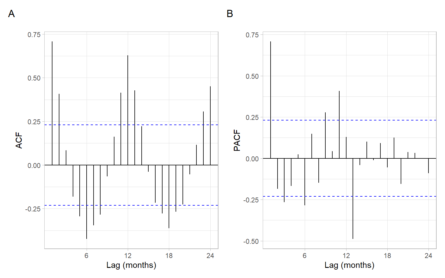
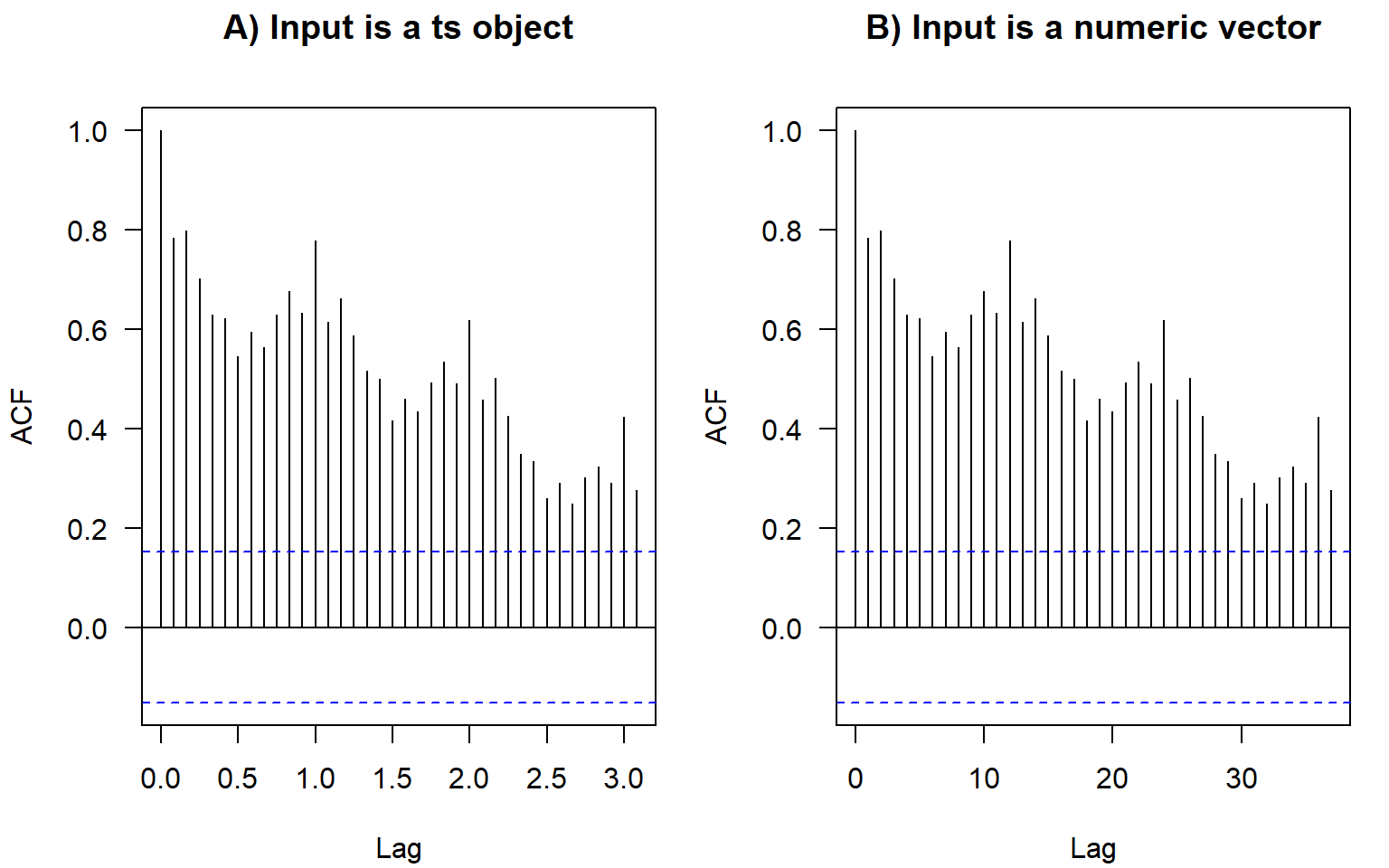
In base-R plots, the lags in ACF plots are measured in the number of periods. The period information (or frequency, i.e., the number of observations per period) is saved in the format ts in R:
We don’t have to convert data to this format. If we plot the ACF of just a vector without these attributes, the values are the same, just the labels on the horizontal axis are different (Figure 2.13). For monthly data, as in the example here, the frequency is 12. Hence, here the ACF at lag 0.5 (Figure 2.13 A) means autocorrelation with the lag \(h=6\) months (Figure 2.13 B); lag 1 (Figure 2.13 A) corresponds to one whole period of \(h=12\) months (Figure 2.13 B), and so on.
The ts objects in R cannot incorporate varying periods (e.g., different numbers of days or weeks because of leap years), therefore, we recommend using this format only for monthly or annual data. Setting frequency = 365.25 for daily data could be an option (although not very accurate) to accommodate leap years.
Converting to the ts format usually is not required for analysis. Most of the time we use plain numeric vectors and data frames in R.
Contributed R packages offer additional formats for time series, e.g., see the packages xts and zoo.
ACF measures the correlation between \(X_t\) and \(X_{t+h}\). The correlation can be due to a direct connection or through the intermediate steps \(X_{t+1}, X_{t+2}, \dots, X_{t+h-1}\). Partial ACF looks at the correlation between \(X_t\) and \(X_{t+h}\) once the effect of intermediate steps is removed.
Shumway and Stoffer (2011) and Shumway and Stoffer (2014) provide the following explanation of the concept.
Recall that if \(X\), \(Y\), and \(Z\) are random variables, then the partial correlation between \(X\) and \(Y\) given \(Z\) is obtained by regressing \(X\) on \(Z\) to obtain \(\hat{X}\), regressing \(Y\) on \(Z\) to obtain \(\hat{Y}\), and then calculating \[ \rho_{XY|Z} = \mathrm{cor}(X - \hat{X}, Y - \hat{Y}). \] The idea is that \(\rho_{XY|Z}\) measures the correlation between \(X\) and \(Y\) with the linear effect of \(Z\) removed (or partialled out). If the variables are multivariate normal, then this definition coincides with \(\rho_{XY|Z} = \mathrm{cor}(X,Y | Z)\).
The partial autocorrelation function (PACF) of a stationary process, \(X_t\), denoted \(\rho_{hh}\), for \(h = 1,2,\dots\), is \[ \rho_{11} = \mathrm{cor}(X_t, X_{t+1}) = \rho(1) \] and \[ \rho_{hh} = \mathrm{cor}(X_t - \hat{X}_t, X_{t+h} - \hat{X}_{t+h}), \; h\geqslant 2. \]
Both \((X_t - \hat{X}_t)\) and \((X_{t+h} - \hat{X}_{t+h})\) are uncorrelated with \(\{ X_{t+1}, \dots, X_{t+h-1}\}\). The PACF, \(\rho_{hh}\), is the correlation between \(X_{t+h}\) and \(X_t\) with the linear dependence of everything between them (intermediate lags), namely \(\{ X_{t+1}, \dots, X_{t+h-1}\}\), on each, removed.
In other notations, the PACF for the lag \(h\) and predictions \(P\) is \[ \rho_{hh} = \begin{cases} 1 & \text{if } h = 0 \\ \mathrm{cor}(X_t, X_{t+1}) = \rho(1) & \text{if } h = 1 \\ \mathrm{cor}(X_t - P(X_t | X_{t+1}, \dots, X_{t+h-1}), \\ \quad\;\; X_{t+h} - P(X_{t+h} | X_{t+1}, \dots, X_{t+h-1})) & \text{if } h > 1. \end{cases} \]
To obtain sample estimates of PACF in R, use pacf(X) or acf(X, type = "partial").
Correlation and partial correlation coefficients measure the strength and direction of the relationship, changing within \([-1, 1]\). The percent of explained variance for the case of two variables is measured by squared correlation (r-squared; \(R^2\); coefficient of determination) changing within \([0, 1]\), so a correlation of 0.2 means only 4% of variance explained by the simple linear relationship (regression). To report a partial correlation, for example, of 0.2 at lag 3, one could say something like ‘The partial autocorrelation at lag 3 (after removing the influence of the intermediate lags 1 and 2) is 0.2’ (depending on the application, the correlation of 0.2 can be considered weak or moderate strength) or ‘After accounting for autocorrelation at intermediate lags 1 and 2, the linear relationship at lag 3 can explain 4% of the remaining variability.’
The partial autocorrelation coefficients of i.i.d. time series are asymptotically distributed as \(N(0,1/n)\). Hence, for lags \(h > p\), where \(p\) is the optimal or true order of the partial autocorrelation, \(\rho_{hh} < 1.96/\sqrt{n}\) (assuming the confidence level 95%). This suggests using as a preliminary estimator of the order \(p\) the smallest value \(m\) such that \(\rho_{hh} < 1.96/\sqrt{n}\) for \(h > m\).
By plotting ACF and PACF (Figure 2.14), we observe that most of the temporal dependence (autocorrelation) in this time series is due to correlation with the immediately preceding values (see PACF at lag 1).
We have defined components of the time series including trend, periodic component, and unexplained variability (errors, residuals). Our goal will be to model trends and periodicity, extract them from the time series, then extract as much information as possible from the remainder, so the ultimate residuals become white noise.
White noise is a sequence of uncorrelated random variables with zero mean and finite variance. White noise is also an example of a weakly stationary time series. The i.i.d. noise is strictly stationary (all moments of the distribution stay identical through time), and i.i.d. noise with finite variance is also white noise.
Time-series dependence can be quantified using a (partial) autocorrelation function. We defined (P)ACF for stationary series; R functions also assume stationarity of the time series when calculating ACF or PACF.
After developing several models for modeling and forecasting time series, we can compare them quantitatively in cross-validation. For time series, it is typical to have the testing set (or a validation fold) to be after the training set. Models can be compared based on the accuracy of their point forecasts and interval forecasts.